TypeFace Tuesday :: Word Clock
.

 Certainly clever, but admittedly a little too much work for me. I'm lazy.
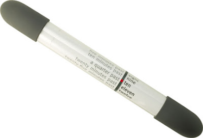
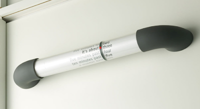
Word Clock by Hans Muller and Hans van Dongen
As its name suggests, Word Clock tells the time in words. The clock consists of two adjacent rolls, contained in a clear acrylic tube. A red mark indicates the line that should be read to tell the time. The left roll spells out five minute increments of time. The right roll contains the numbers one to twelve, spelled out. The gearing is such that as the minutes turn to “twenty-five minutes to,” the hour roll advances. Muller and van Dongen applied for a patent in the United States for their “Elongated Clock” in 1982 and the patent was granted in 1984. This design has been a classic ever since.
Available from Generate Design: $230
[via Better Living Through Design]


4 Remarks:
I absolutely adore this clock!! I wish I could afford it! Thanks for making me aware of it!
I like the concept but the execution is pretty lacking in good design. I wish it was prettier.
I love the idea as well, but I agree that the design good look a little better.
Also you are right on, definitely used Richard Prince and the collaboration with Louis Vuitton as my inspiration :)
I would have to agree. I like the idea of a "word" clock, but the tubular handle design doesn't quite do it for me. It could definitely be done better. Cool concept, nonetheless.
Post a Comment
Feed me comments!
NOTE: All comments are moderated. Any comments deemed to be spam will never see the light of day. Bummer. Also, try not to be a douchebag. Comments with the mark of "The Bag" will be edited or removed completely.
As you were.